Simplifying the T-Life Home Tab Experience
I audited the IA and taxonomy, uncovering flaws that shaped project direction. I also partnered cross-functionally to align stakeholders, lead tradeoff discussions, and reframe the problem around utility and measurable outcomes.
T-Life home tab: The redesign originally launched as a promo-heavy feed that didn’t meet the needs of utility focused customers.
OBJECTIVE
Drive engagement and satisfaction to increase the share of marketing-led self-serve transactions.
PROBLEM
The Home tab was overloaded with promotions, burying core features and lowering engagement. Customers struggled with discoverability, reflected in underperforming CTR, session duration, and sentiment metrics (VoC, app reviews, NPS).
HYPOTHESIS
By simplifying the IA, clarifying categories, and elevating high-value features, we could improve discoverability, increase engagement, and lift satisfaction across customer sentiment metrics.
USERS
All basic, general, and super users who are primary account holders.
APPROACH
• Audited the IA to identify overlaps and structural flaws.
• Facilitated cross-functional workshops to align on a utility-first direction.
• Led tradeoff discussions balancing engineering effort & customer value.
• Validated against CTR, session duration, VoC, app reviews, and NPS.
SOLUTION
• Simplified the Home tab IA into clear, non-overlapping categories.
• Reclassified alerts and notifications to match user expectations.
• Elevated Shortcuts as the utility-first feature; deprioritized widgets based on audit findings.
• Partnered with engineering to scope and deliver incrementally.
RESULTS
• Shortcuts launched with strong engagement; increases over V1 and V2
• Positive shifts in VoC feedback, app reviews, and NPS.
• Deprioritized widget launch, preventing misaligned investment and focusing resources on validated features.
LEARNINGS
• Audits reshape product direction by exposing flawed assumptions.
• Smart and efficient trade-offs secured alignment and buy-in.
• Saying no was as impactful as shipping — it’s not just what you ship, but what you don’t that drives user and business value.
INITIAL ASSUMPTIONS
Early work and stakeholder feedback supported a utility-focused direction with multiple entry points and a framework for categorizing widgets by intent, flexibility, and context.

THE AUDIT
The audit exposed flaws in the stakeholder-approved hypothesis: widgets broke task flows and reinforced the home tab’s cluttered, ad-heavy feel. Pain points focused on discoverability, prioritization, taxonomy, and ease of use.
Concurrent activity led to three major issues: false positives, user- and system-initiated actions lacked differentiation, and timing conflicts that mixed past alerts with real-time changes.

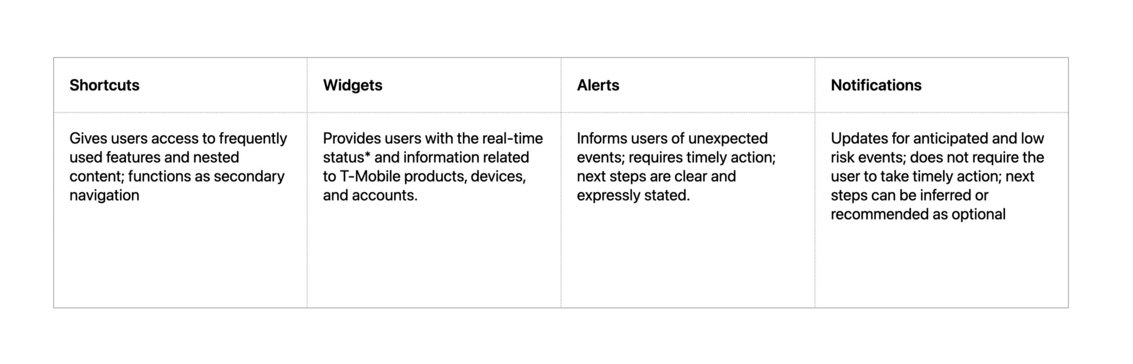
A weak taxonomy and backend logic blurred the line between alerts and notifications and made important information difficult to find. Our near-term guidance was to rename alerts to notifications and remove SyncUP from the P1 category.

The new taxonomy anchors each feature in industry best practices. This brought clarity to our conversations and reduced overlapping and duplicative content.
I organized and co-led a workshop with product to socialize the audit, address design biases, and shift the conversation from stakeholder expectations to user needs.

We leveraged AI to benchmark competitors, fast-track prototyping, and ground decisions in existing research.
AI Tools: 1) Microsoft Copilot for T-Mobile specific research; and 2) Claude for unbranded brainstorming and prototyping explorations. All client-facing design, presentations, prototyping, and handoff files were completed in Figma.
Our focal point shifted from widgets to shortcuts– a pivot that gave us an opportunity to balance user needs with business priorities and technical constraints.

DESIGN
Shortcuts give users a one-click path to high-value tasks like paying bills and checking data.
Editing functionality lets users customize their home tab experience–which helps T-Mobile drive engagement and satisfaction.
Company: Kettle Client: T-Mobile Timeline: 5 weeks Kettle Contributors: Joe Symoski (Design Director); Charlie Humphries (Product Director); Lindsay Cheyenne (Associate Product Director); Danna Khorum (Product Manager); Mallory O’Connor (Senior Visual Designer); Peter Pham (Junior Product Designer) T-Mobile Contributors: Bethany Powell-James (VP of Design); Anna Curtis (Senior Product Manager); Ola Smolskaya (Senior Product Manager); Ankur Argawal (Technical PM & Engineering Lead)